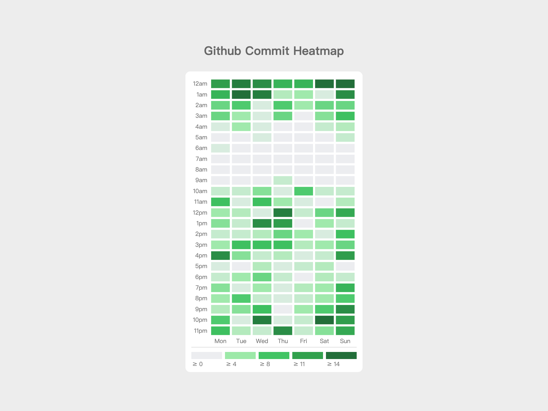
Github Commit Day / Time Heatmap
I have heard of GraphQL for several times already, but I have never tried it before. I decided to have a look on the new technology by reading some articles, and I came across the Github GraphQL API.
The first thing came up in my mind was: "Oh, this is brilliant! I am going to give it a try and build a graph to show statistic of my commit time!". After 3 hours searching and reading documentations, I build my first GraphQL query.
I spent another day wrapping the API call using PHP, as Github GraphQL API requires a GitHub Personal Access Token to access, and I want to secure the token. The remaining parts comes to "How to present the data?".
I thought of using bar chart, pie chart and bubble chart, but I feel like I am missing something. By chance, I saw the Github contribution graph. That's what I want!
That's the whole story why I end up plotting the graph using heatmap.